Vibrant colours, abstract shapes, and gradients are dominating a vast proportion of design online at the moment. However for the other large proportion of the design sphere, we couldn’t be further from that- and if we’re honest, we’re quite excited.
2021 threw the rule book out the window, the design trends are a fusion of retro, ultra modern and old fashioned styles. We’re in ‘anything goes’ territory and we’re loving it.
While past trends have all been driven by the promise of ‘newness’ and ‘modernity’, 2021’s design trends are focused on making people happy.
Whether it evokes nostalgia, soothes the eyes and mind, or just provides some much needed light hearted fun. Design trends this year appear to be creating a much needed safe haven from all the drama that 2020 had to bring.
We’re so excited to see what else might come into the spotlight soon, but for now, here are
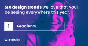
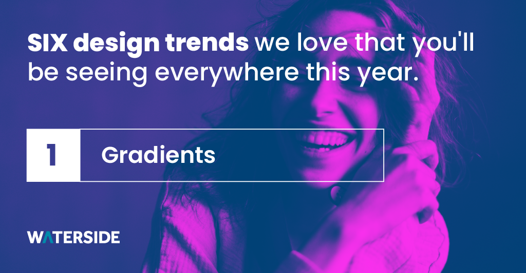
Gradients
Gradients first came into prominence in the 90’s, with the sky blue ombre that screams Saved by the Bell being the height of graphic design at the time.
I say this with a mocking tone because it’s true, as a designer I looked at gradients and other style trends of the 90’s and thought those things would never make a comeback. Yet here I am now, loving it!
This trend reemerged in 2018 with the infamous rebranding of Instagram’s logo. I think I speak for a lot of people when I say I was shocked by this design choice at the time, but I’m a total convert!
The audacious bold colours create contrast and the illusion of depth that adds vibrancy and movement to the design. Gradients bring a wonderful sense of energy to things that is just so refreshing.
It’s such a versatile thing that can be used across backgrounds, text fill ins, call to action buttons and much more. If you look for it, you’ll see it everywhere, and I for one am happy about that.
The thing I love most about this trend is that it provides a sense of playfulness and optimism. People are looking to the creative industries to uplift them, and I think gradients are doing just that.
Serif Fonts
I previously mentioned that 2021 has revealed some trends that don’t quite fit the 30 year cycle, and this is one of them- Serif Fonts.
I have always been a fan of the classic, traditional charm of a Serif and I couldn’t be happier to see them get the appreciation they deserve.
There was a move to Sans Serif fonts in the 20’s and 30’s that has never really been reversed. Their popularity stemmed massively from their ultra modern feel and screen legibility. However, now technology has caught up with ultra HD screens on almost every new device, isn’t it time that Serif makes it’s return?
2021 says Hell Yes!
This isn’t a diss on Sans Serif by any means, it’s just simply that some brands have never suited the clean style of Helvetica and Monotype Grotesque. It was often seen as the default but now people seem to be exploring what’s more appropriate and representative of their identity and what works best for their company.
The reintroduction of Serif feels like a huge step towards a more authentic design space, one that I’m extremely excited to be a part of.
Dark Mode
Dark mode has become somewhat of a controversial topic. With a lot of people calling it life changing, and others saying it ruins good design.
Me personally? I have completely converted to the dark side.
Dark mode’s popularity lies in the long list of its supposed benefits, users claim that it reduces the amount of light emittance and therefore makes sites easier to read and safer on the eyes, whilst also reducing energy usage and saving on battery life.
The average user will spend the equivalent of 34 years of their life looking at screens, there needs to be some changes made to make screens more user friendly and I believe that dark mode is the first step towards that change.
Science and benefits aside, Dark mode is an extremely attractive alternative to the vibrant white we’re all used to. There’s something about it that speaks to a certain level of richness and luxury, like black coffee and dark chocolate, it oozes elegance and sophistication.
It doesn’t work for everyone and it isn’t everyone’s cup of tea. I get that. But I have to say, I love it!
Illustrations
2020 brought about a movement to support small businesses, support your local and support individual artists, and this is carrying on well into 2021 and beyond. This is possibly why we are seeing illustration and hand drawn elements everywhere! We want to see the humans behind the company name.
It’s that element of personal touch that I think everyone has missed. Following a year of lockdowns where we all had to remain apart, it’s comforting to see that human touch in things. You want to look at something and feel the person behind the work, not the machine.
Using illustrations gives a company so much more personality and makes them that much more relatable to their customers. We see it as a way of re personalising and re humanising brands.
Matchstic’s blog section is the perfect example of this, their use of illustration not only speaks to the brands identity, but also so boldly shows that someone made this, someone is in charge of this article page and cares a lot about its appearance. It just makes their site that much more enticing and makes you truly want to read their blogs.
I hope we see more companies doing this, because I think they’re killing it.
Custom Cursors
I understand your initial thought might be that I’ve gone mad, But here me out.
Custom cursors are bringing back that nostalgic feeling of your first computer, changing the background and the theme and downloading sparkling and flaming cursors that eventually plagued your computer with viruses. Great memories right?
I get it, you’re not sold yet, but these are different.
Custom cursors are being used as a way of cutting through the seriousness of the internet, to bring a little bit of fun back, and, to tell you the truth, they’re extremely clever in the way they lead users to your calls to action.
Burocratik.com have this technique nailed! The combination of a custom cursor and micro animations make for an extremely intriguing website that users will want to spend more time on and engage with, leading to more conversions. Sneaky.
Custom cursors don’t have to be animated, Matchstic, who I mentioned earlier, are a perfect example of this. They’re making great use of this trend as a way to further implement their logo into the user experience whilst also showing a bit of the brand personality.
It’s about creating something that sticks in the users head, and I haven’t been able to get either of these out of my mind.
Scroll Animation
Have you ever browsed a website and been absolutely fascinated by the various motions and effects that show up on your every scroll? This is called scroll animation and this trend is making big waves in 2021.
Scroll animations bring the user to a new and more enjoyable level of information perception. They’re not only entertaining to look at, but they also greatly increase user engagement and make a website and brand more memorable.
Heco and Weglot are 2 examples of companies that have this down to a t!
Their websites are extremely different in intention and appearance, however they both get their point across extremely well. The balance between information and animation is perfect, and there is something about it that just speaks to the child in you. It’s pure fun.
The takeaway from all of this is simple: 2021’s design trends have come about for a much needed break from all the seriousness, and have created a move to a more authentic design space.